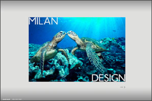
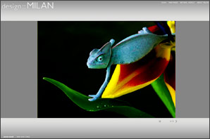
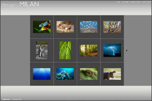
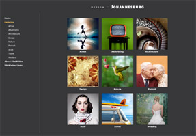
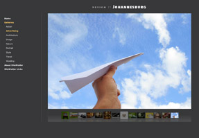
With Milan, you get the best of design and functionality. Images display boldly in the middle of the layout with easy-to-use navigational buttons. Milan is a "liquid" design: the design flows naturally to fill up the entire browser window.
With the Flash slideshow option, galleries in Milan have a great stylish feel, with the images floating sharply against the middle background. Available in over 30 color themes, Milan can look simple or cutting-edge modern.
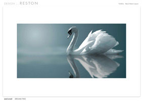
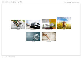
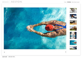
Reston is designed for the imagemaker who wants a clean, elegant and modern design. With its top-right navigation and pull down menus for galleries, Reston is easy to navigate and excels in displaying horizontal images.
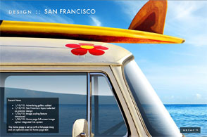
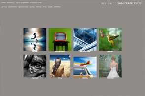
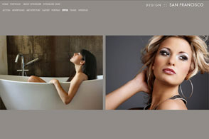
Like all of SiteWelder's designs, galleries can be displayed as normal HTML pages or in Flash slideshow format. Reston also features an option for site-wide audio. Just upload an MP3 file into your home page section of your PageEditor and it will play on your site. An audio button appears on your pages to turn the audio off-and-on.  San Francisco is our most unique design and one of our most popular layout choices. San Francisco is our most unique design and one of our most popular layout choices.With large images displaying in horizontal scrolling area, San Francisco loads quickly and is very easy to navigate. If you upload all of your images at the same height, the design gives a great look-and-feel. With its built-in image scaling, San Francisco will automatically size down your image galleries to display correctly in all image browsers.
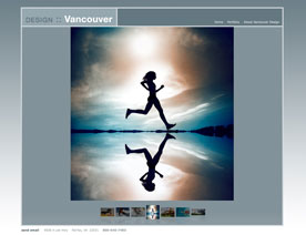
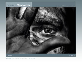
The third of SiteWelder's designs with available site-wide audio, Vancouver featues a modular and modern look. With pull-down gallery menus, navigating through your site is easy and intuitive.
Among its many color theme choices, many feature gradient and pattern backgrounds. As with all of SiteWelder's designs, galleries can be displayed in HTML or Flash slide show format. Additionally, SiteWelder's flexible design structure allows users to display images at any size they wish.
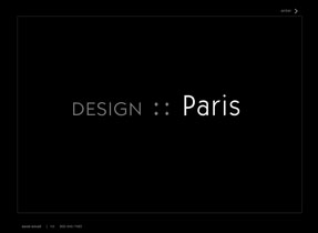
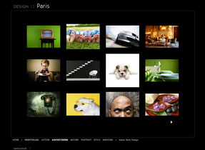
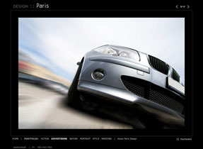
Paris features a center-floating display window with bottom navigation. Viewers go directly into large images in galleries, and image navigation is easy through a top-right arrow and image numbering setup.
Images can be displayed in HTML or Flash slideshow format. With the appropriate image sizing, the entire display box can be filled with your images, leading to a clean and dynamic image display.
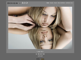
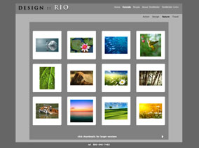
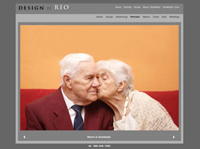
With Rio's richly-layered design and thumbnail slides, a rich viewing experience is guaranteed for your visitors. Navigation is clear and easy at the top right of the pages, and images can be displayed in HTML or Flash slide show versions.
As with all of SiteWelder's designs, you can assemble a customized color theme for your site setup.
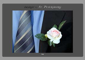
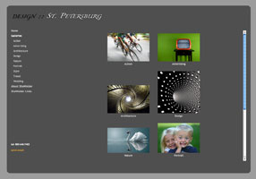
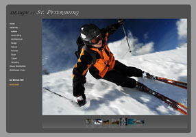
St. Petersburg's rounded edges and center-screen display directs your viewers nicely into your images and presentation. With left-side navigation and large image display area, St. Petersburg is great for setting up your site with SiteWelder Flash slide show presentations.
In our site example here, we've set up the display with no home page navigation and a custom logo setup. A slide show plays on the entry page as well.
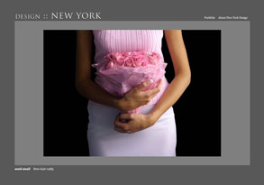
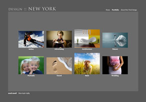
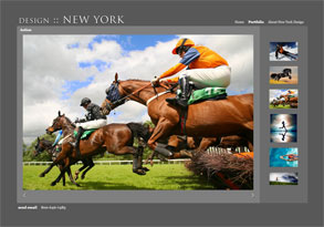
Similar to the Reston design, New York uses sharp-looking boxes to frame your work. With right-side thumbnails on HTML galleries, your users can easily look through your work. And the top-based navigation includes pulldowns for the image gallery links.
New York is clean, and crisp and directs your visitors towards the middle of the screen for maximum image impact.
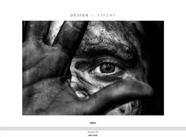
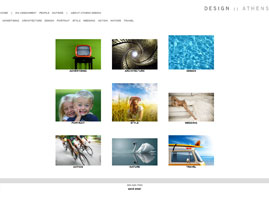
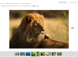
Athens is the original SiteWelder design. With its straightforward design and easy-to-use navigation setup, it's a great option.
Galleries can be displayed in HTML or Flash slideshow format - in both cases, thumbnails will display below large versions of your images. Wide-format photographers have also found Athens to be a good design choice - there is plenty of horizontal space to display your extra-wide images.
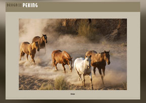
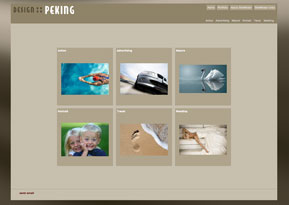
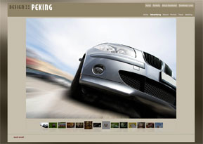
Peking's distinctive navigation bar can give your site an organized and elegant look-and-feel. Layers of colors give a feeling of depth to your site, and Peking offers the option of a number of color themes with flowing background images behind your site content.
As with other site designs featuring background image options, you can upload your own background image as part of a custom color theme.
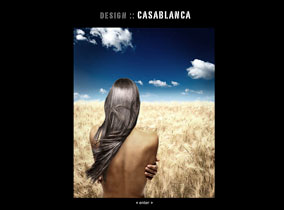
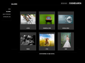
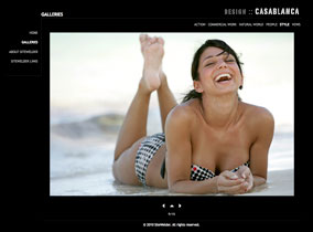
Looking for something different? With Casablanca, you get SiteWelder's classic easy-to-use navigation, but the left-side navigation wraps nicely around your images in a unique style. When viewing your galleries in regular HTML mode, you'll first arrive at thumbnail groupings of your images - clicking on individual thumbs will take you into large versions of the images. And Casablana is a nice way to display Flash slideshow galleries as well.
Casablanca's flexible format is also good for displaying extensive informational content: you pages will flow naturally down as you add more to your pages.
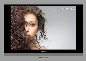
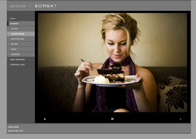
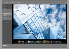
With Bombay, you'll get multiple layers of tightly-integrated design elements within a modern-looking web format. Navigation is made easy through the expanding left-side navigation framework.
When you display your galleries in Flash slideshow format, they will display very effectively within the framed design format as well.
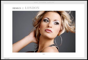
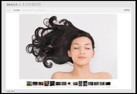
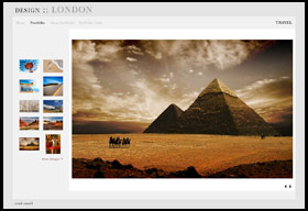
With London's expansive design and easy-to-navigate features, you'll get a stylish and effective presentation for your work.
Featuring left-side thumbnails in HTML galleries, London looks great and is simple to use for your visitors. Optional pulldown menus for your galleries makes navigation a snap to use as well.
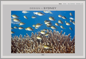
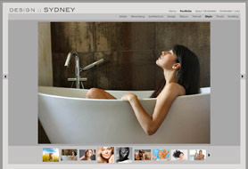
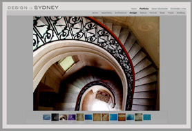
One of our favorite designs, Sydney is a straightforward and elegant design for your images. With layers of colors flowing through the navigation, background and image display, your work will look its best in regular HTML or Flash slideshow format.
Thumbnails will display with your images at the bottom of the layouts.
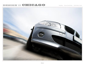
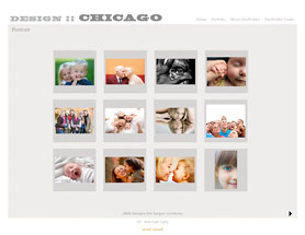
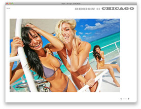
With Chicago's straightforward countenance, you might expect a straightforward approach to image display. But once you start clicking on the image thumbnails in your galleries, you get a nice surprise: a self-contained popup window of the large versions of your images in an easy-to-use display.
If you choose to display your work in Flash slideshows, they will look great in the bordered lines of the layout. Galleries will display in pulldown menus.
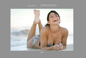
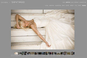
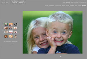
Santiago is deceptively simple. Designed to display in one-color displays, your images will float beautifully in a dynamically-scaling layout.
With HTML display, thumbs will display to the left of your images. In Flash slideshow format, you images center nicely on the page. With all of SiteWelder's layouts, you can turn off the navigational links on your home page for a simplified display.
|
